How to Use Your Core Values to Inspire, Retain, and Energize Your Team
For the last few decades, but especially so in recent years, people are seeking out more than just an income from their place of employment. More...


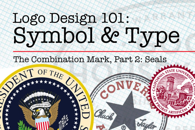
In this fifth article in the series, Logo, Corporate Identity or Brand—What's the Difference? we continue to explore the third category of logo, the combination mark. In case you have not read the previous articles, Logo Design 101: The Symbol looked at the origin, history, purpose, and meaning of symbols. Logo Design 101: The Wordmark dealt with the importance of font choice, typeface design, color, style and creative interaction of letterforms in creating a distinctive wordmark. The combination logo design strategy, because it contains both a symbol and type, builds on the content covered in both of these previous two articles, and also addresses the integration of these elements.
The exhaustively comprehensive logo reference series Logo Lounge has published several volumes of world-class logos. Their books and website display logos according to design approach, content, and business or industry, with these categories: initials, typography, enclosures, display type, calligraphy, crests, sports, heads, people, mythology, birds, fish, bugs, reptiles, animals, nature, shapes, symbols, arts, miscellaneous, food, structures, transportation. In The Combination Logo, Part 1, we focused on symbols derived from letterforms. The Combination Logo, Part 2 will present a brief history and overview of seals.
The term "seal" refers to a device that makes an impression in wax, clay, paper, or other material, and also to the impression it makes. The original purpose was to authenticate a document, or a wrapper, envelope or container for valuable objects or information. The stone cylinder seals of Mesopotamia, signet rings of ancient Egypt, stone and ivory seals of ancient Greece and Rome, "chops" of China, Japan and other Asian countries, medieval European wax seals, and today’s embossed paper, metallic stickers and rubber stamps demonstrate societies' longstanding cultural, governmental and religious organizations’ need for graphics to (literally) seal, authenticate and validate documents, certify professional standing, and signify official and ceremonial importance.

Seals have been used throughout history to communicate—authenticating official documents, identifying and establishing the authority of organizations or individuals.
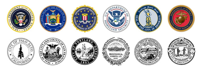
Another definition of seal is the design or graphic used to represent a country, state, municipality or official organization. Many of these designs feature iconic imagery representing the ideals, authority and purpose of the organization.

Seals of national, state, county and municipal entities

Seal logos of educational institutions often use the same approach, conveying authority, history and stability.
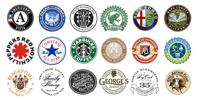
In a company’s logo design process, if the research supports it, a seal logo design can be used to impart legitimacy, authority, history, a vintage or retro feel, cultural importance, institutional prominence, strength and stability. The distinct nature of the company can be further informed by image choice(s), color, typestyle and layout.

The official, historical feel of seal logos can contribute to an effective, elegant, succinct, solid statement of identity.
In my next post we continue to explore other categories of combination logo layout styles and image categories.
The Change Conversations blog is where changemakers find inspiration and insights on the power of mission-driven communication to create the change you want to see.
© 2009- to present, Marketing Partners, Inc. Content on the Change Conversations blog is licensed under a Creative Commons Attribution-Noncommercial-NoDerivs 3.0 United States License to share as much as you like. Please attribute to Change Conversations and link to ChangeConversations.
Creative Commons License may not apply to images used within posts and pages on this website. See hover-over or links for attribution associated with each image and licensing information.

For the last few decades, but especially so in recent years, people are seeking out more than just an income from their place of employment. More...

You know nonprofit organizations need websites just as small businesses do, but you may be surprised to learn nonprofit sites can be more complex and...

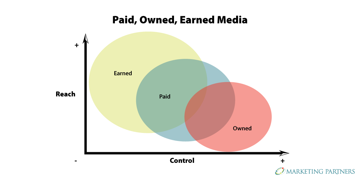
In today’s rapidly evolving media landscape, understanding where and how your story is told isn’t just strategic—it’s essential. How you communicate...