How to Use Your Core Values to Inspire, Retain, and Energize Your Team
For the last few decades, but especially so in recent years, people are seeking out more than just an income from their place of employment. More...


In this fourth article in the series, Logo, Corporate Identity or Brand—What's the Difference? we start to explore the third category of logo design, the combination logo. Logo Design 101: The Symbol looked at the origin, history, purpose, and meaning of symbols. Logo Design 101: The Wordmark dealt with the importance of font choice, typeface design, color, style and creative interaction of letterforms in creating a distinctive wordmark. Because it contains both a symbol and type, the combination logo design strategy includes much of the content covered in both of these previous two articles, and also addresses the integration of these elements.
Design of the combination logo demands equal attention to symbol development and type treatment, to assure visual harmony and strategic impact. The look and feel of a symbol can drive typeface choice and styling, and vice versa. Type contributes shape, color, style and information to a mark. Type placement, readability and eye path are important. How the type and symbol interact is as much a design consideration as font choice and illustration style and content. The best combination logos effectively communicate the story of the business and/or the brand through seamless integration of symbol and type.
The exhaustively comprehensive logo reference series Logo Lounge has published several volumes of world-class logos. Their books and website display logos according to design approach, content, and business or industry, with these categories: initials, typography, enclosures, display type, calligraphy, crests, sports, heads, people, mythology, birds, fish, bugs, reptiles, animals, nature, shapes, symbols, arts, miscellaneous, food, structures, transportation. In this article we will concentrate on the use of initials.
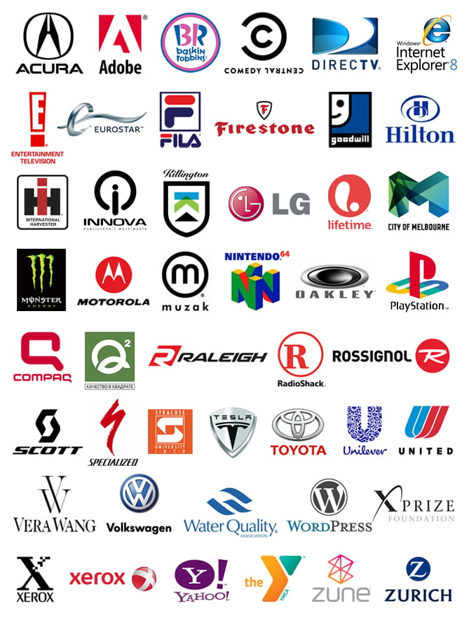
Any logo design must begin with research into the client, their company, mission, culture, industry, and demographics. Depending on the result of this research, the branding strategy may suggest that an appropriate symbol design may use initial(s) from the company name. Here are examples of well known combination logos using initial symbols, from A-Z:

Various treatments of initial symbol logo designs
There are a variety of options for this approach: an unmodified or slightly tweaked letter in an enclosure (E, Firestone, Hilton, Innova, muzak, Radio Shack, Rossignol, WordPress, Yahoo, Zurich); interactions between letterforms (Baskin Robbins, Comedy Central, International Harvester, LG, PlayStation, Syracuse University, Vera Wang, Volkswagen); a stock font with an added graphic element or modification (Explorer, Xerox1); abstraction or deconstruction of the letterform (Acura, Adobe, DirectTV, Hilton, Innova, Killington, Lifetime, Motorola, Q2, Raleigh, Scott, Syracuse University, United, XPrize,YMCA); custom typography (FILA, Compaq, Specialized, Tesla); simple or complex illustration of the letterform with a treatment that informs, supports or creates the brand look and feel (Eurostar, goodwill, LG, City of Melbourne, Monster, Nintendo, Oakley, Toyota, Unilever, Xerox2, Zune).
Many brilliant initial symbol designs capitalize on serendipitous letterform elements and/or interactions, coincidences that suggest the company's purpose or communicate the brand message. Basically, written language is a series of symbols: individual letters comprised of unique positive and negative shapes, lines, angles and energy. When the designer chooses the appropriate font, deconstructs a letterform to those basic elements, astute observation discerns relationships and interactions between those elements. Capitalizing on these, and modifying and accentuating if necessary, creates a mark that speak to us on a whole other level. That is when the magic happens. You can see this in the logos of Baskin Robbins, Goodwill, LG, Q2, Syracuse University, Toyota, and two of my favorites: Killington, where a green mountain intersects with a blue sky to form a sideways K, and Water Quality, in which a W and Q flow out of 3 simple shapes.
In my next post we will examine more categories of combination logo designs.
The Change Conversations blog is where changemakers find inspiration and insights on the power of mission-driven communication to create the change you want to see.
© 2009- to present, Marketing Partners, Inc. Content on the Change Conversations blog is licensed under a Creative Commons Attribution-Noncommercial-NoDerivs 3.0 United States License to share as much as you like. Please attribute to Change Conversations and link to ChangeConversations.
Creative Commons License may not apply to images used within posts and pages on this website. See hover-over or links for attribution associated with each image and licensing information.

For the last few decades, but especially so in recent years, people are seeking out more than just an income from their place of employment. More...

You know nonprofit organizations need websites just as small businesses do, but you may be surprised to learn nonprofit sites can be more complex and...

In today’s rapidly evolving media landscape, understanding where and how your story is told isn’t just strategic—it’s essential. How you communicate...