How to Use Your Core Values to Inspire, Retain, and Energize Your Team
For the last few decades, but especially so in recent years, people are seeking out more than just an income from their place of employment. More...


Knowing how to optimize photos for your mobile-friendly site has never been more important. Accessing the Internet with mobile devices, such as smart phones and tablets, has increased dramatically in recent years. So much so there is a growing Mobile First movement in website development to focus on designing for mobile devices before accommodating the traditional desktop environment. And Google recently changed its SEO algorithm to favor sites that are mobile-friendly, either by being designed as mobile-only sites or by utilizing responsive design. To assure our clients' audiences have the best possible user experience, we have been offering and promoting responsive website design since 2012 as we saw mobile access skyrocket. But photos can be a special challenge for a mobile-friendly site.
Choosing the right images for your mobile-friendly site, sizing, cropping and optimizing them properly is critical to assure the user experience is enjoyable, seamless and consistent across multiple platforms and different screen resolutions. If the user has an unpleasant experience, like something that looks broken, difficult navigation, or too long of a wait, they are unlikely to continue browsing your site, and will probably not return. According to KISSmetrics, 40% of people abandon a website that takes more than 3 seconds to load.
With the rise in mobile devices accessing the Internet, we have also seen the increase in websites that feature larger images, wide format, parallax, and continuous scrolling. These two paradigms would seem to be at odds with each other, especially since wireless and cellular access are typically slower than hard-wired connections. In other words, we have a potential problem when bigger, richer websites need to be seen and easily navigated on smaller, slower devices. Fortunately there are solutions.
Without getting into details of software, hardware and coding specifics, suffice it to say there are many solutions available to solve this issue, both on the server-side of your web hosting service, and the client-side for those visiting your site. Make sure your website host has the latest software and updates, and that their server speed and bandwidth is state of the art. They should have the software and/or coding necessary to determine the device that is accessing your website's content—to differentiate between a desktop computer, smart phone, or tablet with high-resolution display—and adjust the image delivery accordingly. And, client-side, when designing a responsive site, your developer needs to implement proper coding, image optimization techniques with thorough knowledge of the site's design features server requirements in order to suggest and implement the best solutions that will fit within your development budget.
1. Choose clear, impactful images that are not too busy or complex at smaller sizes. This applies also to avatar design—make sure an avatar is easily read and distinct at small sizes.
2. Make sure the proportion of your image is appropriate. For example, if you need a wide shot for a home page image slider, use one that has relevant content within the cropped size, bearing in mind that various devices will crop the same image differently. Also make sure your image can be cropped and sized effectively for all places in which your image will appear, for example, your preferred social media platforms, email templates, etc.
3. Upload images that are sized properly. This means if your website features wide or large images, find the largest pixel dimension needed and do not exceed that. If necessary, downsize using a pixel-based photo manipulation program like Photoshop. Note that some web design programs or content management systems will automatically provide several sizes of your photos after you upload your original, and then serve the appropriate size for each device.
4. Make sure your images are optimized, that is, compressed as much as possible while still looking sharp on high-resolution or Retina displays. There are several effective photo optimization/compression applications that can shrink your image file size, which speeds up load time without affecting appearance.
5. Evaluate both your site hosting service/server and developer carefully, to ensure your website is properly coded and the right software is in place to detect which device is accessing your content so it can serve up the correct images efficiently — to make sure your customer has the best possible experience.
Addressing The Responsive Images Performance Problem: A Case Study, Smashing Magazine
Responsive Images Done Right: A Guide To <picture> And srcset, Smashing Magazine
Optimizing Responsive Design Websites for Performance, Sitepoint
The Change Conversations blog is where changemakers find inspiration and insights on the power of mission-driven communication to create the change you want to see.
© 2009- to present, Marketing Partners, Inc. Content on the Change Conversations blog is licensed under a Creative Commons Attribution-Noncommercial-NoDerivs 3.0 United States License to share as much as you like. Please attribute to Change Conversations and link to ChangeConversations.
Creative Commons License may not apply to images used within posts and pages on this website. See hover-over or links for attribution associated with each image and licensing information.

For the last few decades, but especially so in recent years, people are seeking out more than just an income from their place of employment. More...

You know nonprofit organizations need websites just as small businesses do, but you may be surprised to learn nonprofit sites can be more complex and...

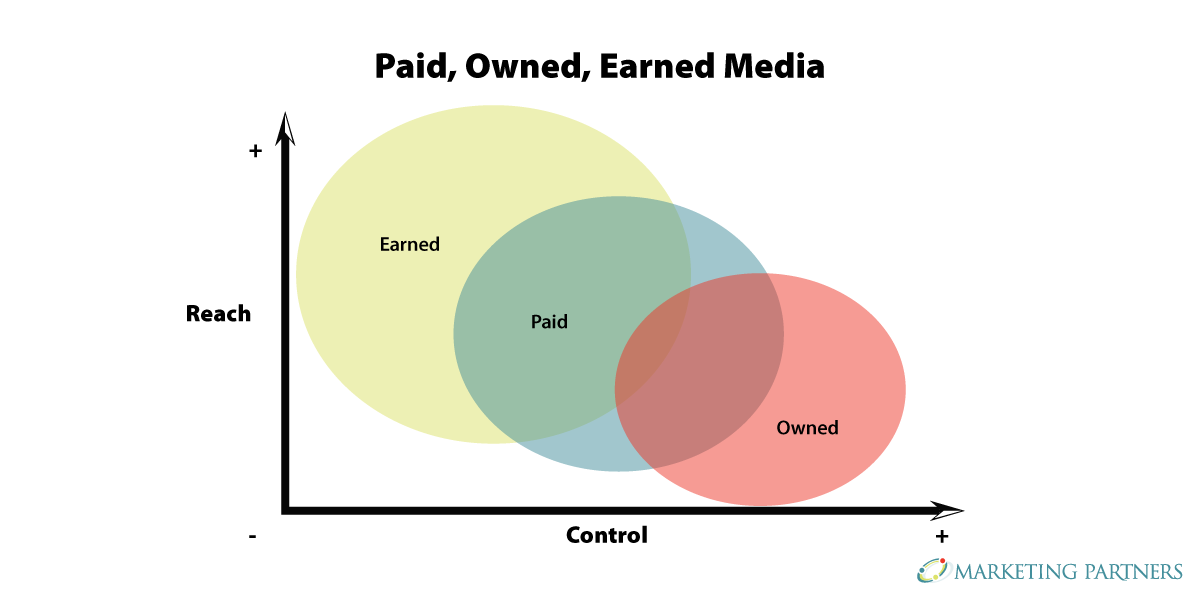
In today’s rapidly evolving media landscape, understanding where and how your story is told isn’t just strategic—it’s essential. How you communicate...