 Pat Heffernan
How to Select the Best Typography for Your Infographics
You sit down at your computer to develop an infographic and couldn’t be more excited to share it with your mission driven audience. Then you suddenly...

You’ve read the statistics about the power of visuals (especially infographics). You know visual content is more likely to have an impact, to be shared, and to be remembered. But for you and many nonprofits, creating an infographic can seem like a fantasy when just keeping up with day-to-day demands for written content and photos is a challenge. You can do it. There are five things you need to know to create a fantastic, hard-working infographic for your nonprofit.
Because one person’s “perfect” may be another’s “eh,” I want to begin by describing the two criteria I consider essential to qualify as a fantastic infographic for any mission-driven organization.
For more on effective infographic design, check out these posts on the design basics and examples from two different issue areas.
Anatomy of Effective Infographic Design
Top Five Early Childhood Infographics
Top 6 Sustainability Infographics
Ask yourself:
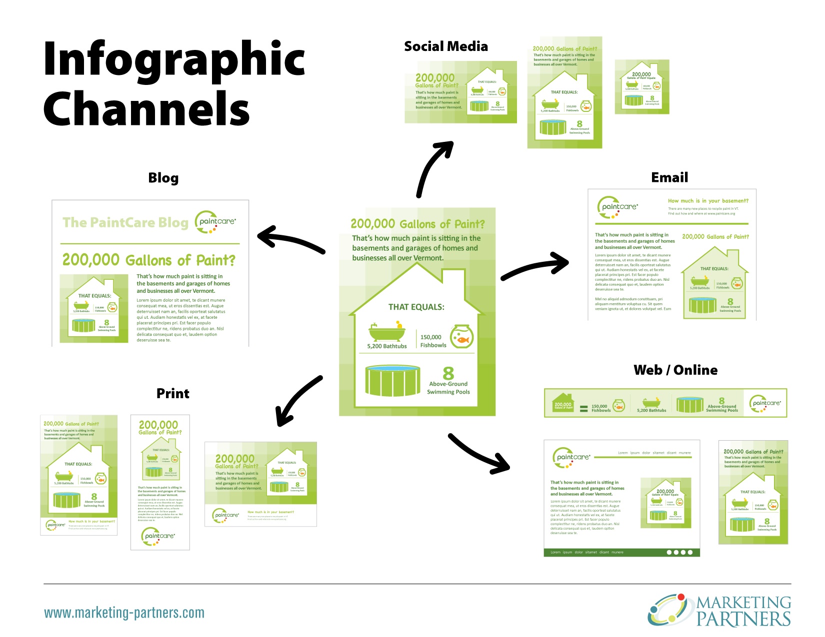
How and where can your infographic be used? Different formats and channels reach different audience segments and accomplish different things. If you are investing in creating a durable graphic asset, you want it to be flexible enough to be repurposed for multiple channels.
Select the most compelling data to support your key message, remembering less is better than more. A social math or visual analogy can help to explain large numbers or a complex concept. You are likely to use your own original data, but you may also collect third-party data such as government research reports for your sector. If you use third-party data, be sure you properly cite your sources just as you would in any good piece of content.
To keep your infographic uncluttered when you have a ton of different source URLs, include a simple URL at the bottom of your infographic that links to a page on your site listing the individual stats used in your infographic, and their sources.
If your infographic is key to supporting a major goal for your organization, you definitely want to hire a professional graphic designer to make it for you. There are literally hundreds of infographics published every single day. And a stunning design can help make yours stand out. However, if you're on a tight budget I'm going to show you some free tools that you can use to create viral-worthy infographics.
To start to get a good idea of your design options, search a couple of the major infographic directories.

Visual.ly is the web's #1 directory for infographics. And it's a great place to get a feel for the current infographic landscape.
Just head over to http://visual.ly/ Enter your content type (infographics) or industry (nonprofits/government) in the top toolbar.

Another great resource is Pinterest. While there is no screening for quality on Pinterest, the large number of boards and pins offers a quick snapshot of the good, the bad, and the ugly infographics out there. I suggest starting with this collection of nonprofit annual report infographics:
https://www.pinterest.com/npmktgd/nonprofit-annual-report-infographics/

Canva is a useful tool for non-designers to create designs, manipulate images, lay text on images, and so forth. There are many free sample infographics templates and images to work with, and if you need more, the per-image charges are inexpensive.
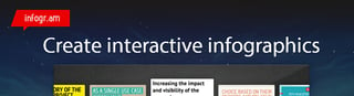
If you have little to no design experience, Infogr.am is a great tool. It offers different infographic templates and tools for customizing your infographic. You can use charts, graphs, maps, images, and icons to really spice up your data and make it visually appealing.
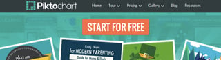
A tool similar to Infogr.am, Piktochart makes it easy for you to create and customize infographics within its templates. This tool is meant for users with little design experience who want to create attractive infographics. If you’re going to be using one of these two tools often, try using them in combination with one another. This gives you access to more templates that you can use to vary your content.
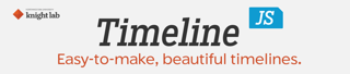
One type of data visual that I can see many nonprofits using are timelines. Timelines are a great way to display your data by looking at changes or events over time.
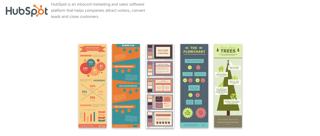
For the price of sharing your email address, HubSpot offers 15 free and easy to use templates for infographics.
https://www.hubspot.com/infographic-templates
These directories and free design tools are a wonderful foundation for your first do-it-yourself effort, or to brief a professional designer about what you do or do not like.
To keep up on the latest on advancing your mission through design and change communications:

You sit down at your computer to develop an infographic and couldn’t be more excited to share it with your mission driven audience. Then you suddenly...

The power of visual storytelling can be compelling and immediately engaging. In today’s marketing world, strong visuals are a necessary element in...
The current wave of infographic usage is only gaining momentum. From social media to corporate reports and even the evening news, you’re seeing these...