Are Your Branding Colors Web Accessible?
Consistency is king when it comes to using your branding colors across all mediums, including your website. But designing for legibility and...
4 min read
Pat Heffernan
:
11/9/17 10:05 AM
Making sure that your website reaches and communicates effectively to everyone requires attention to many factors—design, language, search optimization, and adherence to accessibility guidelines and regulations. I’ll look specifically at website design for accessibility in this blog post and address inclusive language and other factors in a future post.
The Americans with Disabilities Act (ADA) prohibits discrimination against people with disabilities in several areas, including employment, transportation, public accommodations, communications and access to state and local government’ programs and services. But in 1990 when the ADA was passed, websites as we know them did not exist, so there were no specific regulations or guidelines for accessibility in the digital world written into the law. Now there are an increasing number of guidelines and regulations that apply to website content and design to enable access by and empower people with disabilities as well as those without.
In 1998 Congress amended the Rehabilitation Act of 1973 to require Federal agencies to make their electronic and information technology accessible to persons with disabilities. Section 508 is an extensive, comprehensive set of regulations that apply to federal agencies and firms that receive federal funding and contracts to ensure their development of electronically available information is held to the highest standard.
Section 508 is the most restrictive in terms what is allowed for content and design. Although at the time it set the gold standard of inclusiveness and accessibility, now it’s generally acknowledged that it’s not practical or possible in many cases for commercial websites to be in 100% compliance, and that the regulations actually impair accessibility for many people.
By one estimate, seventy percent of websites, including those of government agencies and their contractors, do not meet Section 508 standards. But knowing you are not alone is little comfort. Legal actions have surged in recent years, with one legal blog listing 751 actions since 2015, mostly against restaurants and retail stores, while another lists actions against more than three dozen colleges and universities. But as the New York Times notes, whatever the motivations of the lawyers involved, lawyers represent “people who are being barred from accessing public services.”
You want to be inclusive and effectively reach everyone who may be interested in your product or service, whether or not you may be vulnerable to legal action.
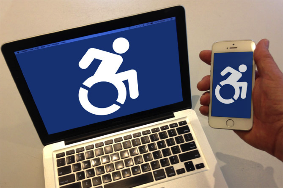
Improvements in design practices for accessibility are emerging as awareness and understanding of the challenges faced by individuals with disabilities increases. The iconic International Symbol of Access, designed in the 1960s, has been modified to show motion and vitality, and the new mark is gaining acceptance.
![]() And as technology expands, new standards and guidelines that improve upon Section 508 have been developed to inform and assist web developers as they do their best to provide maximum accessibility within the scope of what is possible and desired for their website functionality and content.
And as technology expands, new standards and guidelines that improve upon Section 508 have been developed to inform and assist web developers as they do their best to provide maximum accessibility within the scope of what is possible and desired for their website functionality and content.
The Worldwide Web Consortium (W3C) is the organization that regulates web content, code standards and compliance. Their Introduction to Web Accessibility outlines the entire scope of why and how to make the web accessible. A specific set of protocols was released in December 2008 called the Web Content Accessibility Guidelines (WCAG) 2.0.
The overall principles are outlined using the acronym POUR, which stands for:
Perceivable Provide text alternatives (larger text, braille, etc.) for non-text content (images, etc.) that indicate what a design/content element is, shows, says, or does; Provide alternatives for time-based media live audio and video, e.g., text descriptions, captions, etc.); Provide content that adapts to different, simpler layouts without losing information or structure; Make information distinguishable, easy to see and hear—separated from, or with increased contrast from background.
Operable Elements in the user interface, basically all functionality, work with keyboard alone or mouse. Give users enough time to read and use content. Do not use elements that induce seizures. Ensure easy navigation, let user find content easily and know where they are.
Understandable Make sure text is readable, easily understandable in plain language (not IT speak); web pages should appear and operate predictably; help user avoid/correct mistakes.
Robust Content can be interpreted by a wide variety of browsers/user agent, including assistive technologies. Basically, tags and code that ALL devices can understand.
WCAG 2.0 is a comprehensive set of guidelines with very specific options and direction, and every marketing communications professional should give it a read for a complete understanding of the protocols suggested for those with different disabilities. WCAG 3.0 is nearing release, which should further refine these guidelines, but for now, check out these examples of basic practices.
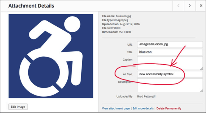
Make sure all non-text content is available in text. This means visual or audio elements are described in electronically readable text for those who are visually impaired and may be using a text reader. Alt tags are a common way to do this easily. When placing non-text elements into a web design, there is a window for entering alternative (ALT) text that describes or names the item:
Make Sure User can Control Text Readability
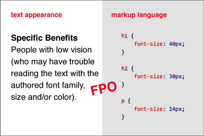
Web designers and developers must use CSS markup to describe text size, color and font family of headlines and body text. This gives people with limited vision, visual tracking problems, or cognitive disabilities that affect reading, the ability to adjust these attributes, and the foreground and background colors affecting type readability.
Typeface choice is important, especially when viewing text on a backlit screen. Serifs aid readability, and font thickness helps compensate for screen glare.
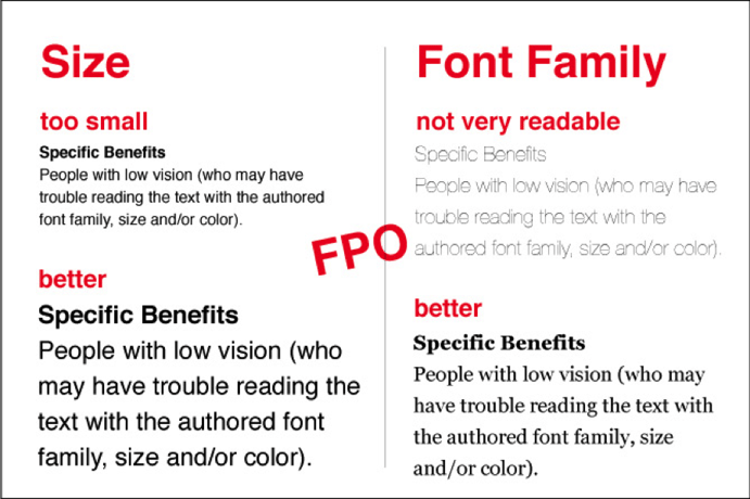
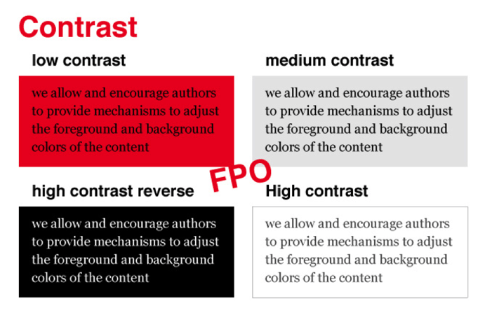
Your background color choice can also greatly affect type readability. Too little contrast can make text hard to read, and color choice is a part of the equation. It is important to achieve a pleasant, readable body and headline text without using too much contrast, which can make the viewer have a harsh experience.
You will want to be familiar with six additional guidelines for inclusiveness and accessibility for those with specific disabilities that WCAG 2.0 addresses.
- HTML form controls for keyboard control
- timing control/enough time
- seizure prevention
- clear navigation
- readable
- predictable
Make sure to make accessibility part of the conversation when preparing your creative brief, talking to your marketing firm about developing or improving your website design, and all your marketing communications. Ask yourself, “am I considering people with different abilities?” and “are my marketing materials created in a way that includes everyone I want to reach?”
Testing HTML for Section 508 Compliance, online course from U.S. Dept. Veterans Affairs
Section 508 Standards - Web-based intranet and internet information and applications
US Access Board Guide to the Standards - Web-based Intranet and Internet Information and Applications
Please Note: The US Access Board is in the late stages of revising its Accessibility Standards through the formal rulemaking process. According to the US Access Board, it is strongly anticipated that the 508 Standards for websites will be harmonized with the internationally recognized standards for Web accessibility, the Web Content Accessibility Guidelines (WCAG 2.0) EXIT published by the W3C (World Wide Web Consortium). The §1194.5 Equivalent Facilitation clause of Section 508 explicitly permits government agencies to use alternatives (e.g., WCAG 2.0) that result in substantially equivalent or greater access. If appropriate, accessibility can be provided using the WCAG 2.0 if it provides better accessibility instead of using the current Section 508 standards.

Consistency is king when it comes to using your branding colors across all mediums, including your website. But designing for legibility and...
A reader recently responded to my blog post Typeface Choice: Ask yourself Three Questions, by raising an important series of questions on changing...
There are over 1 billion people around the world with disabilities, who have a combined spending power of approximately $6 trillion. This includes...